Role
UX Designer + Project Manager
Context
The Mobility Innovation Center, a Seattle based organization that aims to solve transportation issues came to our team with the request of finding a solution to increase mobile ticketing usage among tourists in Seattle. Reduction of cash payments will increase operational efficiency and reduce operation costs, since more than $5 million dollars alone is spent processing cash payments. One of the largest contributors to cash payments is tourists, which is the user group we were assigned to handle.
The current solution offered is the Transit Go mobile ticketing application, which allows users to purchase tickets for various modes of transportation in Seattle, including metro busses, the light rail, water taxis and more. With the current rating of this application being a 2.4 in the App Store, we used this as motivation to figure out what tourists want and to create a more effective redesign from our findings.
Research
To conduct research on our problem space effectively, we did a mix of interviews and usability testings with the current Transit Go mobile ticketing application, as well as surveys to learn more about tourists' preferences surrounding public transportation. My teammates and I, pictured on the left, were conducting usability testing at the Airport Link Light Rail station.
Interview Goals
○ Determine traveler preferences surrounding mobile ticketing and public transportation
○ Determine a traveler's goals for trips to new cities
Usability Testing Goals
○ Identify the pain points of the current Transit Go app
○ Determine a traveler's needs in a mobile ticketing application
Survey Goals
○ Learn more about user preferences surrounding public transportation in general
○ Determine a traveler's goals for trips to new cities
Research Findings
○ Tourists tend to hear about public transportation options via word of mouth or internet research
○ Tourists prioritize convenient transportation options, like Uber or Lyft
○ Transit GO has inconsistent terminology and appears busy, making it challenging for users to navigate
○ Most tourists were reluctant to download a city-specific app for one time use
Personas + User Journey Maps
Personas and User Journey Maps for each key traveler type were created to hone in on who we were building for.
Ideation and Information Architecture
Conducting a thorough ideation process for our redesign was crucial to creating an effective information architecture that mapped out paths to help users achieve their goals as simply as possible.
Lo-Fi Mockups
Lo-Fi mockups were created and tested out with users by means of usability tests. Feedback was taken from these sessions and used to develop a more effective and thoughtful hi-fi prototype.
Hi-Fi Prototype
The final Hi-Fi prototype focused on improving upon 4 main features to help tourists in Seattle best achieve their goals:
Buying
Explore
Wallet
Trip Planning
EcoCAR
prototyping for UW EcoCAR's year 1 competition car-sharing initiative
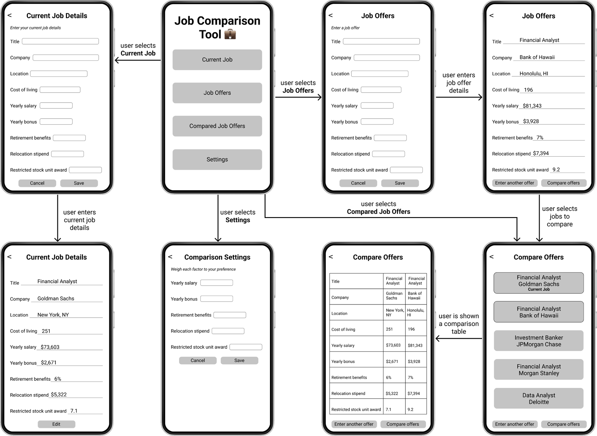
Job Comparison Tool
creating the user interface for a job comparison application built in Android Studio for my master's in Computer Science program at Georgia Tech
